Nothing Lasts, and That's the Whole Point: How Japanese Seasonal Thinking Is Reshaping American Design
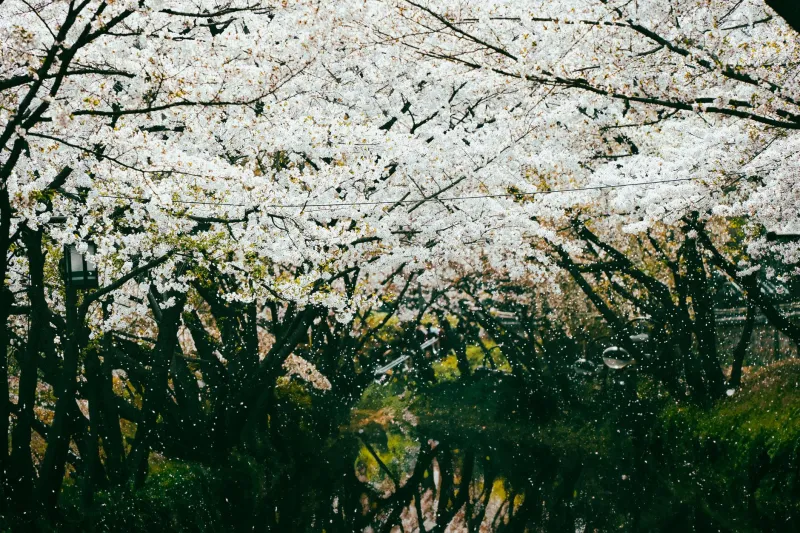
There's a moment every autumn when the leaves in Central Park hit that particular shade of amber and everyone on Instagram loses their minds. For about two weeks, New Yorkers who normally speed-walk past every tree suddenly stop, tilt their phones upward, and try to catch something they know is already leaving. Nobody needs to explain why. The feeling just lands.
What most people don't realize is that there's a Japanese word for exactly that feeling — mono no aware — and it's been quietly rewiring how a generation of American designers thinks about their work.
What Mono No Aware Actually Means (And What It Doesn't)
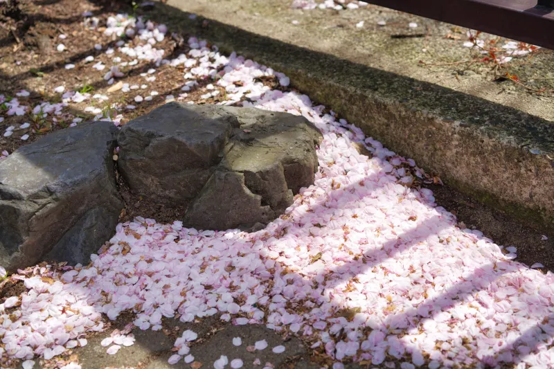
Translate it literally and you get something like "the pathos of things" — which, honestly, doesn't do it justice. Mono no aware is closer to that bittersweet ache you feel when something beautiful is passing. It's not grief, exactly. It's more like a heightened awareness of a moment because you know it's finite. The cherry blossoms in Kyoto are the classic example: celebrated not despite the fact that they fall within a week, but because of it.
For centuries, Japanese art, architecture, poetry, and craft have leaned into this idea. Seasonal motifs aren't just decoration — they're philosophical statements. A winter textile pattern isn't just cold-weather aesthetic; it's an acknowledgment that this moment, this temperature, this quality of light, belongs to right now and nowhere else.
Western design, by contrast, has historically chased the opposite. Timeless. Classic. Built to last. The Eames chair, the Swiss grid, the Helvetica logo — the highest compliment you could pay American design was that it looked like it could have been made in any decade. Permanence was the whole ambition.
Something is shifting.
The Capsule Drop as Cultural Philosophy
Look at how American fashion has reorganized itself around the concept of the seasonal drop. It's tempting to read this purely as a marketing strategy — and sure, scarcity sells. But talk to the designers behind some of the more thoughtful capsule collections and you hear something different. There's a genuine interest in designing for a moment rather than beyond it.
Brands like Entireworld and even bigger players like Patagonia have started building seasonal storytelling into their collections in ways that go past color palette. They're asking: what does it feel like to wear this in October specifically? What does this fabric do in the context of a particular kind of weather, a particular kind of mood? The garment becomes a marker of a season rather than a wardrobe staple you're supposed to hold onto forever.
That's a pretty radical departure from the "buy less, buy better, buy forever" logic that dominated sustainable fashion discourse for a while. It's not anti-sustainability — it's a different relationship with time.
UX Design Is Starting to Feel the Seasons
Here's where it gets interesting for people who work in digital spaces. For years, the goal of a great app interface was frictionless consistency. Same experience, every day, every season, every mood. The interface was supposed to disappear.
But a small and growing wave of UX designers is experimenting with what you might call temporally aware design — interfaces that subtly shift with the time of day, the season, or even the user's location and weather. Some of this is functional (dark mode at night, adjusted contrast in bright sun). But some of it is purely atmospheric, and that's the part that's philosophically interesting.
Designers at studios in Brooklyn, Portland, and the Bay Area have started talking openly about wanting their digital products to feel like they know what month it is. Not in a gimmicky way — not a snowflake animation in December — but in a more considered, tonal sense. A meditation app that feels genuinely different in January than it does in July. A reading interface that carries a different weight in autumn.
The language these designers use keeps circling back to the same ideas: presence, impermanence, the quality of now.
Why American Creatives Are Ready for This
It would be easy to write this off as another case of Western culture borrowing an aesthetic without understanding the philosophy underneath it. That happens, and it's worth being honest about. But there's something more genuine going on here too.
American culture has spent the last decade in a complicated relationship with permanence. The things we were told would last — careers, institutions, platforms, even the climate — have turned out to be a lot more fragile than advertised. There's a generation of designers who grew up watching MySpace become irrelevant, watching companies they admired pivot into something unrecognizable, watching neighborhoods change faster than the maps can keep up.
In that context, an aesthetic philosophy that says yes, things change, and that's not a failure doesn't feel like a foreign import. It feels like permission.
Mono no aware doesn't ask you to be sad about impermanence. It asks you to be present to it. To let the fact that something is passing make it more vivid, not less. That's a different emotional posture than nostalgia, and it's different from the relentless optimism that American design culture has sometimes demanded.
The Design Challenge Nobody Talks About
Here's the honest complication: designing for impermanence is genuinely hard in a commercial context. Clients want logos that will still work in twenty years. Investors want products with staying power. The whole infrastructure of American design business is built around longevity as a value proposition.
So how do you make work that honors the temporary without making it feel disposable? That's the tension a lot of designers are sitting with right now, and there isn't a clean answer yet. What's emerging looks less like a solution and more like a practice — a way of asking different questions at the start of a project. Not just will this last? but what moment is this for? What feeling does it carry, and how long is that feeling supposed to live?
Some of the most interesting work coming out of American studios right now has that quality — a kind of deliberate seasonality, a willingness to be of its time rather than outside of it.
The cherry blossoms fall. The amber leaves drop. The app gets sunset eventually. And maybe, if the design was honest about all of that from the beginning, it was more beautiful for knowing it.