When There's No Word for It, That's When the Real Design Begins
Here's something that happens a lot in design school critiques: a student presents work that's doing something genuinely interesting — something atmospheric, something that makes you feel a specific kind of quiet — and the professor says, "So what's the concept?" The student fumbles. They reach for words like minimalism or negative space or restrained. None of them quite land. The room moves on.
But what if the concept was already there, fully formed, in a language the room just didn't speak?
There's a whole vocabulary of Japanese design thinking that doesn't translate into English — not because translation is lazy or incomplete, but because the ideas themselves are rooted in ways of experiencing the world that English hasn't needed to name. And increasingly, designers working between cultures are arguing that these untranslatable concepts aren't just poetic curiosities. They're practical tools. They're ways of seeing that change what you make.
The Gap Is the Feature, Not the Bug
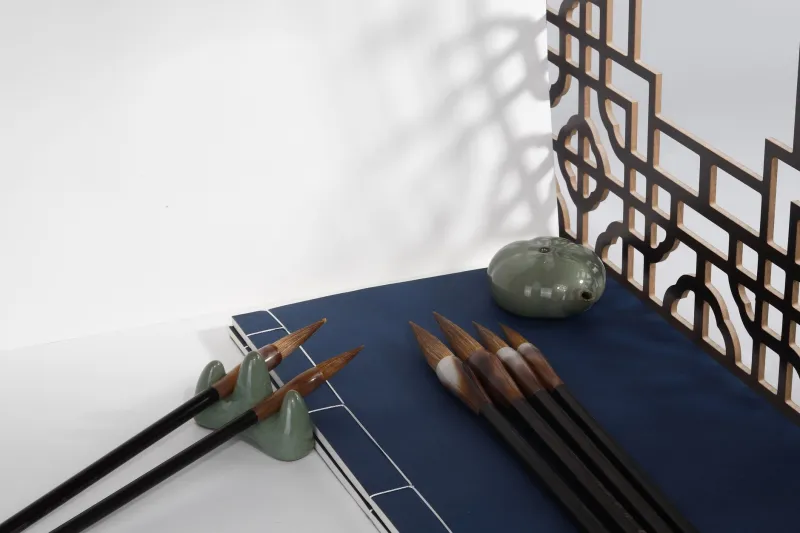
Take yohaku no bi — roughly, the beauty of what's left blank. In Japanese ink painting and graphic design traditions, the empty portions of a composition aren't negative space in the Western sense, where emptiness exists to make the filled parts pop. Yohaku is more active than that. The blank area holds something. It participates. It has intention behind it that the viewer is meant to feel without being told.
When Western designers encounter this idea, the first instinct is usually to translate it: "Oh, it's like breathing room." Or: "It's just whitespace." But those framings immediately flatten it. Whitespace in American design conversation is largely functional — it aids readability, reduces cognitive load, signals premium positioning. Yohaku no bi is none of those things, or rather, it's all of those things and also something else entirely: a philosophical stance on what completion even means.
The designer who tries to apply yohaku by leaving more whitespace is probably missing the point. The designer who genuinely internalizes it starts asking different questions from the start — not "how much should I leave empty?" but "what is this space doing, and does it have the same weight as everything else here?"
That's a different design process. And you can't get there by just learning the definition.
Warmth You Can't Manufacture
Nukumori is another one. It translates loosely as warmth — but not temperature warmth, and not the warmth of a color palette. It's closer to the warmth of human presence, of something made by hand or worn by time, of a space that feels like someone actually lives in it. It's the opposite of sterile. It's the feeling you get in a neighborhood coffee shop that's been open for twenty years versus the one that just got a Condé Nast mention.
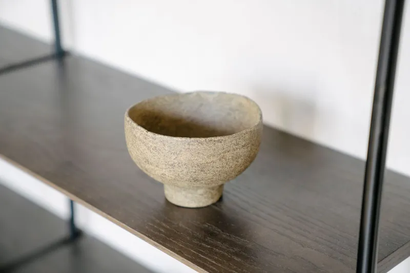
American brands talk about warmth constantly. Whole brand strategies are built around it. But nukumori resists being manufactured, which is exactly what makes it so hard to pursue through conventional design methods. You can't achieve it by choosing warmer hex codes or using a handwritten font. It tends to show up in places where people weren't trying to create it — in the patina on a well-used object, in the slight imperfection of something made by a specific person at a specific moment.
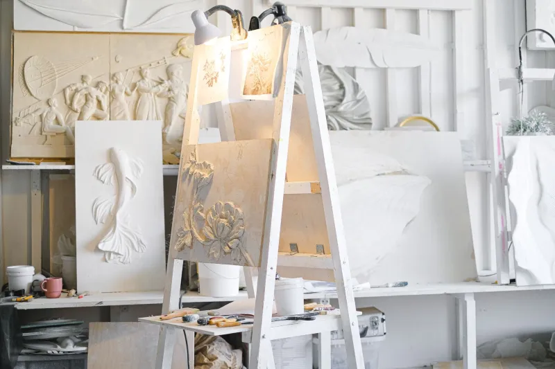
For designers working in product, interiors, or even digital interfaces, sitting with nukumori as a concept — rather than trying to reverse-engineer it into a checklist — tends to produce something more honest. It pushes you toward restraint, toward durability, toward designing things that are meant to be lived with rather than photographed once and replaced.
The Books You'll Never Read (And What They're Really About)
Okay, tsundoku is a little different — and a little more fun. It's the habit of acquiring books and letting them pile up unread. In Japanese, it's not exactly a design concept, but it's traveled far enough into global cultural conversation that designers and visual artists have started using it as a lens.
What's interesting is what tsundoku implies about aspiration and accumulation. The pile of unread books isn't failure — it's a portrait of who you want to become, of curiosity that exceeds your current capacity. Applied to design thinking, some practitioners use it as a shorthand for holding references you're not ready to use yet. Collecting visual languages, aesthetics, influences you can't fully articulate — not to deploy immediately, but to let them sit until they're needed.
There's no English word for that practice. "Inspiration hoarding" sounds neurotic. "Reference collecting" sounds clinical. Tsundoku captures something gentler — the patient, slightly chaotic accumulation of things that matter to you, even if you can't say why yet.
Why This Matters Beyond the Aesthetics
The argument here isn't that Japanese design concepts are superior, or that Western designers need to wholesale adopt another culture's framework. That road leads somewhere pretty uncomfortable pretty fast, and we've all seen the Pinterest boards to prove it.
The argument is simpler: when you encounter an idea that your native language can't quite hold, that's information. That gap is telling you something about the limits of your current thinking. And if you resist the urge to immediately translate it into something familiar, you get to sit in a more generative space for a while.
Some of the most interesting designers working in the US right now — people moving between Japanese and American visual traditions, or between any two distinct cultural frameworks — describe this as one of the actual advantages of living between worlds. You accumulate concepts that don't fit neatly together. You end up with a vocabulary that's partly words and partly feelings and partly images that don't have names yet.
And from that slightly uncomfortable, slightly unresolved place, you make things that couldn't have come from one tradition alone.
You Don't Have to Name It to Use It
This is maybe the most counterintuitive part for designers trained in the American school of "explain your concept clearly and defend every choice." Some ideas are most useful when they stay a little fuzzy. When you know what you're going for but you don't have a word for it, you're forced to stay close to the feeling itself rather than the label.
Yohaku no bi. Nukumori. Tsundoku. Say them out loud a few times. Let them sit. Don't rush to translate them.
Something might start to happen in your work that you also won't have words for — and that's exactly the point.