Empty Is Everything: The Japanese Design Secret Western Creatives Are Finally Catching On To
Walk into most American design studios and you'll hear a version of the same note in every critique: "It feels too empty." Add something. Fill the corner. Give it more energy. Western design culture has long operated on the assumption that space is a problem waiting to be solved — a gap that needs plugging before the work is done.
Then there's ma.
Pronounced like the first syllable of "mama," this Japanese concept describes the intentional pause between things — the gap between two notes in music, the threshold between a room and a hallway, the white space around a single brushstroke that makes it breathe. Ma isn't absence. It's presence of a different kind. And slowly, steadily, it's changing how designers in the US think about their craft.
What Ma Actually Means (And Why It's Hard to Explain)
Translating ma as simply "negative space" undersells it in a pretty significant way. Negative space in Western design is typically treated as a compositional tool — a technical consideration. Ma, by contrast, is closer to a philosophical stance. It's the idea that emptiness isn't passive. It does something. It creates tension, invites attention, and gives meaning to whatever surrounds it.
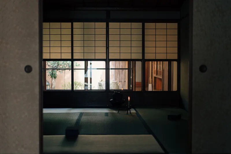
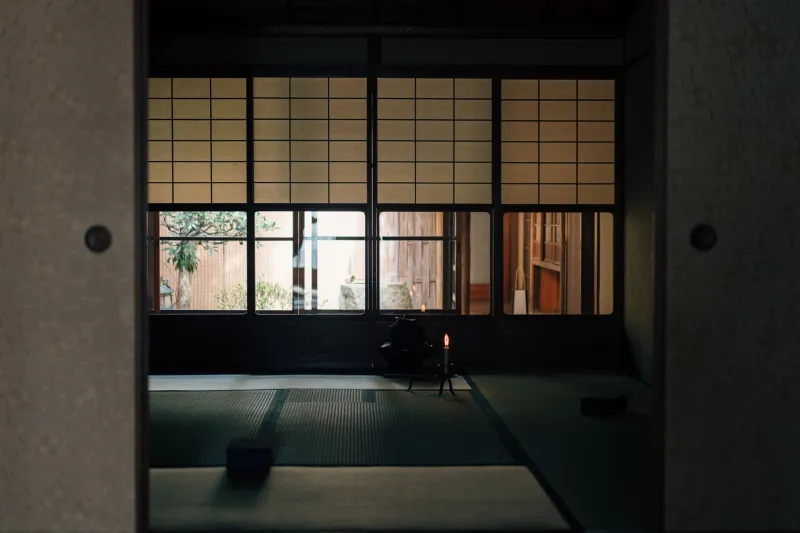
The concept shows up everywhere in Japanese culture — in the silences between lines of a haiku, in the raked gravel of a Zen garden, in the way a shoji screen filters light into a room without overwhelming it. It's not decoration. It's structure.
For Western designers encountering this idea for the first time, the shift can feel almost counterintuitive. You're essentially being asked to trust that doing less is doing more — and in a culture that prizes productivity and visual abundance, that's a harder sell than it sounds.
Where You're Already Seeing It (Whether You Know It or Not)
Here's the thing: ma has been infiltrating American design for years. We've just been calling it other things.
Apple's product design philosophy — minimalist hardware, generous white space in marketing materials, the deliberate simplicity of early iOS interfaces — owes a substantial debt to Japanese aesthetic principles. Jonathan Ive has spoken openly about his admiration for Japanese craftsmanship and the way form and emptiness interact in traditional design. The iPhone's original packaging wasn't just clean. It was considered silence.
In graphic design, studios like Pentagram and Sagmeister & Walsh have produced campaigns where restraint does the heavy lifting. A single word on a vast white field. A logo mark given so much breathing room it almost feels lonely — until you realize that loneliness is exactly the emotional note the client needed.
Digital interfaces are where the conversation gets really interesting right now. As UX designers grapple with information overload — too many notifications, too many options, too much everything — the appeal of ma-informed design is growing fast. Products like Notion, Linear, and even the latest iterations of Google's Material Design have moved toward what you might call structured emptiness: layouts where whitespace isn't wasted real estate but an active guide for the eye and the mind.
The Designers Bridging the Gap
Some of the most compelling work happening in American design right now comes from creatives who grew up moving between Japanese and Western visual cultures — people for whom ma isn't a borrowed concept but a lived one.
Consider the approach of designers working at the intersection of editorial and digital. When you're laying out a magazine spread or a website that needs to communicate both information and feeling, the temptation is always to pack it in. But designers with a grounding in Japanese aesthetics often make the opposite choice: one strong image, generous margins, a headline that doesn't compete with itself. The result reads as confident rather than sparse.
Architecture offers some of the most visible case studies. Kengo Kuma's work — including his contribution to the Japan House in Los Angeles — demonstrates how ma operates in three dimensions. Rooms that feel incomplete on paper become deeply inhabitable in person. The space between structural elements isn't dead air; it's where the experience actually lives.
In branding, the influence shows up in how certain companies are choosing to signal quality. In an era of maximalist streetwear graphics and loud DTC packaging, a growing number of premium brands are betting on restraint. Clean wordmarks. Single-color palettes. Labels with more white than text. It's a visual language that says we're confident enough not to shout — and it's a message that lands.
Learning to Leave Things Out
For designers trained in the Western tradition, adopting a ma-influenced approach isn't just a stylistic adjustment. It requires a genuine shift in how you evaluate finished work.
The question stops being "What else can I add?" and starts being "What would happen if I removed this?" It means sitting with a composition that feels unfinished and asking whether the discomfort is a problem or the point. It means trusting the viewer to complete the meaning rather than spelling everything out.
That's harder than it sounds in a client-facing context. Clients who are paying for a full-page ad tend to want a full page of something. Part of the job becomes educating people on why the empty parts are earning their keep — why the silence is speaking.
But when it works, it really works. There's a reason certain pieces of design stop you cold. A poster that uses one-third of its available space. A website homepage with a single sentence and a lot of room to breathe. A product shot where the background goes on forever. These aren't mistakes or missed opportunities. They're ma — and your eye knows it even if your brain doesn't have a word for it yet.
The Takeaway
Western design has always been good at abundance. We know how to fill space, layer meaning, and pack visual information into every available inch. What we're learning — slowly, and in no small part thanks to the influence of Japanese aesthetics — is that restraint is its own kind of skill.
Ma doesn't ask you to make less interesting work. It asks you to make work where every element, including the empty ones, is doing something intentional. In a visual landscape that's noisier than ever, that kind of quiet might be the most radical thing a designer can reach for.