Neither Here Nor There — And That's Exactly the Point: How Hyphenated Artists Are Reshaping American Visual Culture
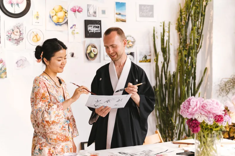
There's a question a lot of bicultural artists get asked that reveals more about the asker than the artist: "So which culture influences your work more?"
The assumption baked into that question — that creative identity is a pie chart, that you're always working from one tradition and borrowing from another — is exactly the kind of either/or thinking that the most interesting designers working in America today are actively dismantling. For artists navigating multiple cultural identities, the work doesn't come from choosing between aesthetics. It comes from living in the friction between them.
And right now, that friction is producing some of the most vital, strange, and genuinely contemporary American design we've seen in decades.
The Myth of the Clean Influence
Let's be honest about something: American design has never been a single, unified thing. It's always been a collision — European modernism hitting commercial urgency, folk traditions bumping into mass production, immigrant sensibilities filtering through mainstream culture. The "American look" in design is, and has always been, a hybrid.
What's different now is that a generation of artists raised across cultural boundaries isn't just importing aesthetics from elsewhere and applying them to American contexts. They're doing something more interesting: they're making work about the space between. The translation gap itself becomes the subject.
This shows up in unexpected ways. A graphic designer who grew up splitting time between Osaka and Ohio might not make work that looks obviously Japanese or obviously American. Instead, they might make work that feels slightly off in both directions — familiar enough to engage you, strange enough to hold you. That uncanniness isn't a bug. It's the whole product.
Minimalism Meets Maximalism: The New Hybrid Aesthetic
One of the most visible tensions in contemporary American design right now is the standoff between minimalism and maximalism. On one side: the clean, restrained, whitespace-heavy aesthetic that owes a heavy debt to Japanese design traditions. On the other: the loud, layered, reference-dense visual language of American streetwear, music culture, and social media.
Most designers pick a lane. Cross-cultural artists, increasingly, are refusing to.
Imagine a brand identity that uses the spare, considered typography of Japanese packaging design alongside the bold color saturation of a New York bodega sign. Or editorial illustration that combines the controlled linework of traditional Japanese woodblock prints with the chaotic energy of American comics. These aren't pastiches or mood boards — they're coherent visual languages that feel new because they are.
The result is an aesthetic that's hard to place geographically or historically, which turns out to be exactly what a lot of contemporary American audiences respond to. We're saturated with work that signals its influences clearly. Work that makes you genuinely uncertain where it's coming from has a quality of surprise that's increasingly rare and increasingly valuable.
What "American" Even Means Right Now
Here's an opinion: the most interesting question in American design isn't "What's trending?" It's "What does American mean?" And for a growing number of working artists, the answer is less about geography and more about a particular kind of cultural experience — the experience of navigating multiple worlds simultaneously and finding that the navigation itself is generative.
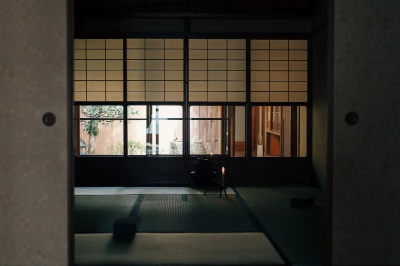
Artists who've grown up between Japanese and American contexts carry a specific kind of double vision. They've learned to read spaces and objects through two different interpretive frameworks, often simultaneously. A room isn't just a room — it's both a Western living space and a Japanese ma-informed environment, and the gap between those readings is where the creative energy lives.
This isn't limited to Japanese-American artists, of course. But there's something particular about the Japanese-Western tension that produces a recognizable aesthetic signature — one that American culture has been absorbing and reinterpreting since at least the Japonisme movement of the 19th century, and that feels more alive and more genuinely two-directional now than it ever has.
The Commercial Moment
It's worth noting that this isn't just an art world conversation. Cross-cultural aesthetics are having a serious commercial moment in American design right now, and brands are paying attention.
The success of Japanese-adjacent visual culture in the US — from the enduring appeal of brands like Muji and Uniqlo to the explosion of Japanese food culture in major American cities — has created real appetite for design that feels culturally fluent in multiple directions. Companies that once hired designers to "translate" Japanese aesthetics for American audiences are increasingly hiring designers who simply live in both worlds and don't need to translate anything.
The shift is subtle but significant. Translation implies a source and a target, an original and a copy. Hybrid design — the real thing, made by people for whom multiplicity is a lived experience rather than a research project — doesn't work that way. It's not Japanese design adapted for Americans. It's something new that neither tradition could have produced alone.
The Creative Advantage of Not Belonging Fully
There's a concept in sociology called "the stranger" — the idea that people who occupy an outsider position in a culture often see it more clearly than insiders do, precisely because they're not fully absorbed by it. The stranger notices things that insiders have stopped seeing.
For bicultural artists, this operates in both directions. You're the stranger in two places at once, which means you're the clear-eyed observer in two places at once. That's not comfortable, necessarily. But it's creatively extraordinary.
The designers doing the most interesting work at this intersection aren't trying to resolve the tension between their cultural identities. They're using it. The not-quite-here, not-quite-there quality in their work isn't a problem to be solved — it's the source of the work's energy and its distinctiveness.
What's Next
If you're paying attention to where American design is moving, the trajectory seems pretty clear. The clean lines between "Japanese aesthetics" and "Western design" are getting blurrier, and the blurriness is the point. The next generation of American visual culture is being built by people who were never on one side of that line to begin with.
That's not a loss of cultural specificity. It's an expansion of what American creative identity can hold. The hyphen in Japanese-American isn't a subtraction — it's an addition. And the work coming out of that addition is, increasingly, some of the most alive and most distinctly of-this-moment design happening anywhere.
Neither here nor there. Exactly where it needs to be.