Empty on Purpose: Why the Smartest Apps Are Learning to Leave Room to Breathe
The Space That Isn't Empty
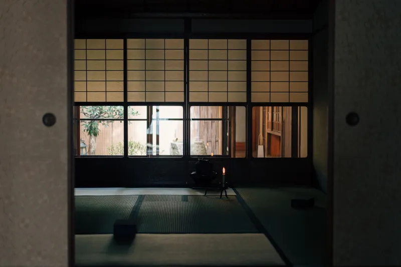
If you've ever walked into a room and felt instantly calm — not because of what was there, but because of what wasn't — you've experienced something close to what Japanese designers have been intentionally crafting for centuries. It has a name: ma (間). Roughly translated as negative space or interval, ma isn't just an absence. It's a presence in its own right. A breath built into the structure of things.
For a long time, that idea felt almost untranslatable to Western digital design. American tech culture historically rewarded density — more features, more buttons, more notifications. The assumption was that a packed interface signaled value. But somewhere around the mid-2010s, the pendulum started to swing. And now, in 2025, the design language of minimalism informed by Japanese aesthetics isn't just a trend. It's becoming the baseline expectation for serious digital products.
What 'Ma' Actually Means in Practice
Let's get concrete. Ma isn't the same as minimalism in the Western sense. Western minimalism often chases a kind of sterile perfection — think all-white rooms with one expensive chair. Ma is less about reduction for its own sake and more about intention. The space serves the meaning. The gap creates rhythm. The silence makes the sound worth hearing.
In UI/UX terms, this translates to a few specific ideas:
- Generous padding and whitespace that lets interface elements breathe rather than compete
- Staged information delivery — showing users what they need when they need it, rather than everything at once
- Interaction pauses — micro-animations and transitions that give users a moment to register what just happened
- Visual hierarchy through restraint — letting one element speak clearly instead of five elements shouting
Think about how Notion restructured its interface over recent years, pulling back visual clutter and letting the content itself become the dominant element. Or how the meditation app Calm built its entire visual identity around slow transitions, muted palettes, and interfaces that don't demand your attention — they invite it. These aren't accidents. They're philosophical choices.
From Tatami Rooms to App Stores
The roots of this go deep. Japanese spatial design — in architecture, in ink painting, in the tea ceremony — has always treated emptiness as active rather than passive. A tokonoma (alcove) in a traditional Japanese room holds one scroll, one flower arrangement, one ceramic piece. The surrounding space isn't wasted. It's doing the work of focusing your attention, slowing your perception, making that single object more meaningful than a wall of objects ever could.
When you look at a well-designed app like Things 3 (a task manager beloved by designers) or the reading app Readwise Reader, you see that same logic applied to pixels. Tasks and articles sit with room around them. Typography is given space to establish hierarchy naturally. Color is used sparingly — almost like punctuation rather than decoration.
Creative studios in cities like Portland, Austin, and Brooklyn have been particularly receptive to this influence, partly because their client bases skew toward wellness, lifestyle, and culture brands — industries where the feeling of calm is itself a product feature.
Why American Designers Took So Long
Honestly? A lot of it came down to metrics. For years, engagement was measured by clicks, time on page, and interaction volume. A cluttered interface that kept users bouncing around could look successful by those numbers. But as UX research matured, designers and product teams started tracking different things: task completion rates, user stress indicators, return visits driven by positive association rather than habit or addiction.
When you measure whether users enjoy an experience rather than just whether they use it, the case for ma gets a lot stronger.
There's also a cultural shift happening in how Americans relate to their devices. Post-pandemic, the conversation around digital fatigue became mainstream. People started talking openly about screen exhaustion, notification overwhelm, and the particular dread of opening an app that immediately assaults you with badges and alerts. Into that moment stepped a design philosophy that had quietly been saying for centuries: less is not deprivation. Less is respect.
The Risk of Getting It Wrong
It would be incomplete to talk about this without acknowledging the pitfalls. Ma isn't a coat of paint. Slapping a lot of whitespace onto a poorly structured interface doesn't create calm — it creates confusion. Users still need to know where to look, what to do, and how to navigate. Negative space only works when the positive space is doing its job clearly.
There's also the appropriation question. Borrowing aesthetic language from another culture requires some genuine engagement with the underlying values, not just surface-level visual mimicry. A design team that adopts a Japanese-inflected visual style without understanding why those choices work — without sitting with the philosophy — tends to produce work that feels empty in the wrong way. Hollow rather than spacious.
The studios and designers doing this well are the ones who've actually engaged with the source material: reading about wabi-sabi, studying Kengo Kuma's architecture, spending time with traditional Japanese craft. The influence shows up in the thinking, not just the aesthetics.
What This Means If You're Designing Right Now
If you're a designer working on a digital product today, here are a few places to start applying these ideas without overcorrecting into sterility:
Audit your current whitespace. Print out or screenshot your interface and circle every place where elements feel crowded. Ask whether the proximity is serving a relationship between those elements or just filling space out of habit.
Slow down your transitions. Even a 200ms ease-in on a modal can create the pause that lets users register a state change. That moment of ma — that brief interval — reduces cognitive load in ways users feel but rarely articulate.
Pick one focal point per screen. Not one section. One point. Where do you want the eye to land first? Design backward from that choice.
Use color as punctuation. If everything is colored, nothing is. Reserve your accent colors for the one thing that needs to speak on each screen.
None of this is magic. But approached thoughtfully, it adds up to something that users experience as ease — that quality of an interface that seems to understand them before they've said a word. That's ma at work. And it turns out it translates just fine.