Lost in the Brief: How to Explain Your Instincts Without Killing What Makes Them Work
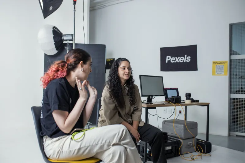
At some point in nearly every project, there's a moment that feels like a trap.
You've made a choice — a font pairing, a color, a layout decision, the amount of white space on a page — and it's right. You know it's right the way you know certain things: not because you can diagram it, but because you've internalized enough to trust the feeling. The problem is that your client is sitting across from you (or, more likely, in a Zoom window with their camera off), and they want to know why.
And the true answer — because it's right — is the one answer you absolutely cannot give.
This is the translation problem nobody talks about. Not the language barrier, not the cultural divide (though those are real), but the specific breakdown that happens when a designer's intuitive, contextual thinking meets an American client's legitimate need for explicit reasoning and measurable outcomes.
Why the Gap Exists in the First Place
American business culture is built on deliverables. Scope documents. KPIs. Measurable outcomes. There's a deep cultural preference for making the implicit explicit — for putting things in writing, for naming the thing so everyone can agree on what the thing is.
This isn't a flaw. It's actually a very useful system for managing complexity across large organizations and diverse teams. When everyone has to articulate their reasoning, assumptions get surfaced early. Miscommunications get caught before they become expensive.
The friction happens when that system encounters a creative process that is, by nature, partly pre-verbal. Not all good design decisions can be fully explained before they're made. Some of the best ones emerge from a kind of trained intuition — the result of years of looking, absorbing, and internalizing what works and why. Trying to translate that into a bullet-pointed rationale can feel like trying to explain why a joke is funny. The explanation tends to kill the thing it's describing.
Japanese craft tradition has a name for this kind of knowledge: kata — the embodied understanding that lives in the hands and eyes of a skilled artisan, not in a manual. The tea master doesn't explain each movement of the ceremony; the movement is the explanation, for those trained to read it. Historically, Japanese artisans justified their methods to patrons not through documentation but through demonstrated mastery and track record. Trust was built over time, through the accumulation of work that consistently delivered something the patron couldn't have specified in advance.
American clients, generally speaking, don't have that relationship with their designers. And even if they did, the organizational structures they operate in often require written rationale regardless of trust. So you need another way in.
The Over-Explanation Trap
The instinctive response to a client asking why this? is to explain everything. To walk them through the entire thought process, the references you pulled, the decisions you considered and rejected, the logic chain that led you here. It feels thorough. It feels professional.
It usually backfires.
Over-explanation does two things you don't want. First, it signals uncertainty. When you justify a decision at length, you inadvertently communicate that the decision might be up for debate. Clients are perceptive — if you're working this hard to convince them, maybe they should push back. Second, it buries the actual value. The insight that matters often gets lost inside paragraphs of context. By the time you get to the point, the client has already started forming their own opinion.
The goal isn't to explain everything. The goal is to give the client enough language to feel confident in the decision — and to do it in a way that doesn't open the door to revisions you don't actually need.
A Framework That Actually Works
Here's an approach I've found useful, borrowed loosely from how skilled artisans have always communicated with patrons who weren't trained in their craft.
Lead with the outcome, not the process. Instead of explaining how you arrived at the decision, explain what the decision does for the audience. This typeface choice creates a sense of authority without distance — it signals expertise without being intimidating. The client doesn't need to understand typography theory. They need to understand what the audience will feel. Start there.
Anchor to something they already trust. Every client has reference points — brands they admire, competitors they respect, experiences they've had that felt right. When you can connect your intuitive choice to one of those anchors, you give them a way to hold onto the decision. This approach is similar to how [Brand X] positions their premium line — understated, but unmistakably considered. You're not copying; you're providing a translation.
Name the alternative and why you rejected it. This one is counterintuitive but powerful. Briefly describing the road not taken — I considered going bolder here, but it would have competed with the headline rather than supporting it — does two things. It shows that your choice was deliberate, not default. And it preemptively closes the loop on the revision your client was about to suggest.
Set a threshold for the conversation. Not every design decision needs to be relitigated in the feedback round. Before you present, tell your client what you'd like their focus on: I'm confident in the structural choices here — what I'd love your input on is whether the tone of the copy feels right for your audience. You're not shutting down feedback. You're directing it toward the places where their input is genuinely useful.
Protecting the Thing That Makes It Work
The deeper challenge here isn't really about communication tactics. It's about figuring out which parts of your creative process can be explained and which parts need to be protected from explanation.
Some decisions can be articulated clearly without losing anything. Others — the ones that live in the space between intention and instinct — start to dissolve the moment you put them into words. The skill is knowing the difference.
Japanese lacquerware masters talk about urushi — the lacquer that requires dozens of layers, each one invisible beneath the next, to achieve the final depth of surface. No single layer explains the result. The result only makes sense as an accumulation. Some creative choices work the same way. They're the product of everything you've absorbed, and no single explanation will capture them.
For those choices, the most honest thing you can say to a client is something like: I've made this call based on what I know works in this context — I'd love to show you why in the final piece. It's not a dodge. It's an invitation to trust the process a little further, backed by the credibility of everything you've already delivered.
The brief is never the whole story. Neither is the explanation. The work itself — eventually — has to make the argument. Your job is just to keep the conversation open long enough to get there.