Slow Is the New Scroll: Why the Smartest Brands Are Designing for Depth Over Dopamine
Somewhere between the fourteenth notification and the third autoplay video, a certain kind of exhaustion sets in. It's not quite fatigue. It's more like a dull hunger — the feeling of consuming a lot and being satisfied by none of it. If you've felt it, you're not alone. And if you're paying attention as a designer, you're probably noticing that a growing number of people are actively walking away from experiences built to maximize that exact cycle.
This is the moment I want to talk about. Not the burnout — everyone's talking about the burnout — but what's filling the space it leaves behind.
The Engagement Trap
For about a decade, the dominant design philosophy in American digital culture has been optimization for engagement. More clicks. Longer sessions. Higher return rates. The metrics became the mission, and the mission shaped everything — color choices, copy length, notification timing, scroll behavior. Every pixel was a lever, and the goal was always the same: keep the user in the loop.
The results were impressive, at least on paper. And then they started to curdle.
Users got wise. Ad blockers proliferated. Social media fatigue became a documented psychological phenomenon. The very systems designed to maximize attention started generating a specific kind of resentment — not loud, not activist, just quiet and persistent. People started wanting out, or at least wanting something different.
What they started reaching for looked a lot like the opposite of what they'd been given.
Enter the Boring — In the Best Way
There's a Japanese aesthetic principle called ma — the idea of meaningful negative space, of the pause that gives the note its weight. It's the silence between sounds, the gap between objects, the breath before the next thing. Western design has been notoriously bad at this. We treat empty space as a problem to solve, not a feature to protect.
But look at what's been gaining traction in the American market over the last few years. Muji opened in the US and built a cult following around products that do almost nothing visually except exist with quiet confidence. Aesop turned deliberately unexciting brown bottles into a luxury signal. Basecamp spent years being almost aggressively boring by tech standards — no gamification, no push alerts, no dark patterns — and built a loyal user base that would evangelize the product to anyone who'd listen.
These aren't accidents. They're the result of designers making a deliberate choice: resist the urge to optimize for the next click, and instead design for the moment after the user decides to stay.
Depth as a Differentiator
Here's what I find genuinely interesting about this shift: designing for depth is harder than designing for dopamine. Dopamine-driven design has a feedback loop. You ship, you measure, you iterate. The metrics tell you whether it worked. Depth doesn't have that luxury. You're building for something that takes longer to materialize — trust, familiarity, the slow accumulation of a relationship between a user and an experience.
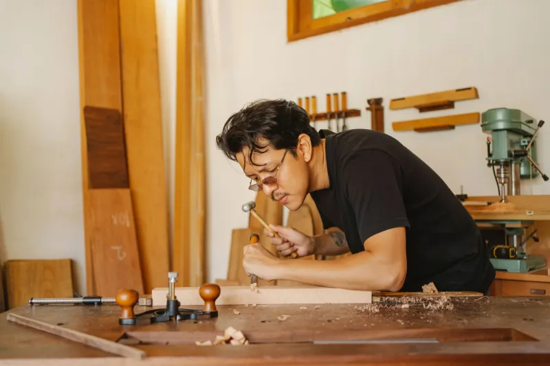
Japanese craft culture has always understood this. The concept of shokunin — the artisan who spends decades perfecting a single skill — is the antithesis of the sprint-and-ship mentality. It's not that the shokunin doesn't care about the audience. It's that they trust the work to speak eventually, and they're willing to wait for that conversation to happen.
Applied to contemporary design, this translates to some specific choices. It means building interfaces that reward return visits rather than first impressions. It means writing copy that earns its length rather than padding for keyword density. It means choosing a typeface that feels right in year three, not just year one.
The brand that's doing this most visibly right now might be Notion. Not because it's beautiful — it's pretty spare, actually — but because it gets out of the way. It trusts the user to find their own rhythm inside it. That's a design philosophy, not just a UX decision.
The Business Case for Boring
I know what you're thinking: this is all very nice, but does it scale? Does patience actually convert?
Increasingly, yes. And the data is starting to catch up with the intuition.
Subscription businesses built on depth — newsletters, curated platforms, slow media — are outperforming their engagement-maximizing counterparts on retention metrics. Customers who come in slowly tend to stay longer and spend more. The acquisition cost is higher, but the lifetime value is substantially better.
More tellingly, the brands that built their identity around restraint are commanding premium pricing in categories where premium pricing didn't used to exist. A plain white tee from a brand with a clear, unhurried point of view sells for three times the price of a louder competitor. The consumer isn't paying for the cotton. They're paying for the feeling that someone thought carefully about this, that nothing was rushed, that there's something here worth coming back to.
That's a design achievement. And it's one that requires resisting enormous pressure to add more, move faster, and chase the next trend.
What This Means If You're Building Something
If you're a designer caught between these two philosophies — the American instinct to optimize and the Japanese instinct to refine — this moment is genuinely interesting for you. Because the market is finally starting to create space for the second approach.
The practical question is how you make the case for it internally, especially in organizations where engagement metrics are still the primary language of success. A few things that tend to work:
First, reframe the metric. Instead of time on site, talk about return rate. Instead of click-through, talk about completion. Depth shows up differently in the data, but it does show up.
Second, find your analog. Every category has a brand that's winning with restraint. Show that example early and often. It's much easier to advocate for a philosophy when there's a real business attached to it.
Third — and this is the one people skip — design for the third visit, not the first. Ask yourself what this experience feels like when someone has been using it for six months. That question changes almost every decision you make.
The scroll isn't going anywhere. But the appetite for something slower, something more considered, something that trusts you to find your own way into it — that appetite is real, and it's growing. The designers who learn to feed it will have a significant advantage over the ones still chasing the next dopamine spike.
Slow is the new scroll. And honestly? It's about time.